Key takeaways
- The two best image sizes for LinkedIn feed posts are 1200 x 1200 pixels (square) and 1080 x 1350 pixels (vertical, 4:5).
- Link previews use 1200 x 627 pixels (about 1.91:1), read from the page's og:image tag.
- A profile picture should be 400 x 400 pixels and a profile background 1584 x 396 pixels (4:1), each up to 8 MB.
- A company logo is 300 x 300 pixels and a company cover 1128 x 191 pixels, each up to 3 MB.
- Carousels take up to 10 images at 1080 x 1080 or 1080 x 1350, all the same size.
The best image sizes for LinkedIn posts in 2026 are 1200 x 1200 pixels for a square image and 1080 x 1350 pixels for a taller vertical one. Exporting at these sizes keeps your images sharp on desktop and mobile and avoids the odd crops that make a post look careless.
Size is a performance question as much as a looks question. The right dimensions keep images clear and noticeable while people scroll, and a badly sized image comes out blurry, cut in the wrong place or easy to skip.
Everything starts with one idea: what aspect ratio is. That ratio sets the shape of the image and how much of the screen it fills, which matters most on phones, where much of your audience probably reads LinkedIn.
The infographic below compares the most common aspect ratios for feed posts.
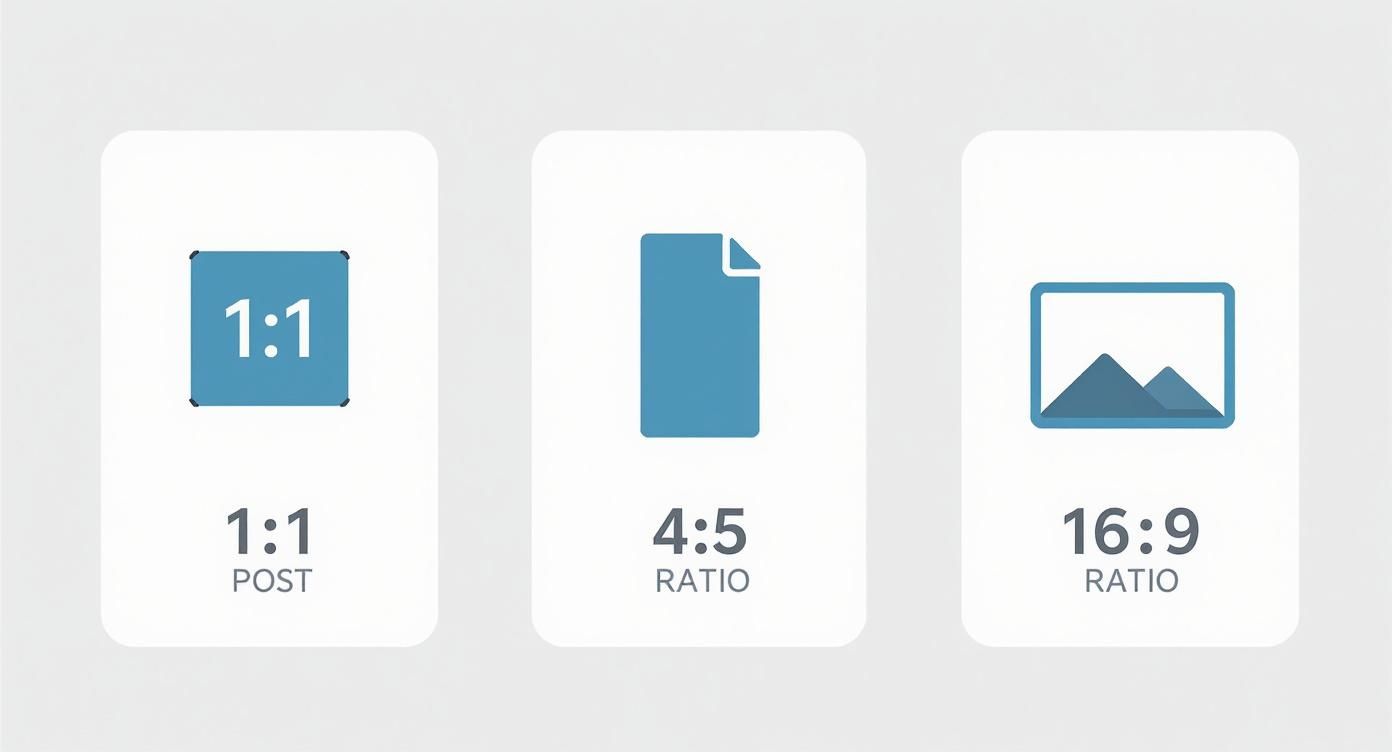
Square and vertical images cover more of a phone screen than wide ones, and more screen means more attention for your post.
What are the LinkedIn post sizes for 2026?
Keep this table handy so you can export once and upload without guessing. The sizes are the practical targets most creators use for feed posts, profile images, company pages and carousels.
| Where the image goes | Size to use (px) | Aspect ratio | What to know |
|---|---|---|---|
| Feed, square | 1200 x 1200 | 1:1 | A safe default on mobile |
| Feed, vertical | 1080 x 1350 | 4:5 | Covers the most of a phone screen |
| Feed, horizontal / link preview | 1200 x 627 | ~1.91:1 | Also the og:image size for shared links |
| Profile picture | 400 x 400 | 1:1 | Shown as a circle, so keep the face in the centre |
| Profile background | 1584 x 396 | 4:1 | Keep the lower-left corner empty for the profile photo |
| Company logo | 300 x 300 | 1:1 | Up to about 3 MB; simple designs read best |
| Company cover | 1128 x 191 | ~5.9:1 | Put the main content in the middle for the mobile crop |
| Company Life tab (main image) | 1128 x 376 | - | Custom modules usually take 502 x 282 |
| Carousel card | 1080 x 1080 or 1080 x 1350 | 1:1 or 4:5 | One size for every card, up to 10 images |
| Video (typical) | 1920 x 1080 | 16:9 | Widescreen default; keep the file size sensible |
If a file is the wrong size, the LinkedIn image resizer converts it, and the LinkedIn image size checker tells you whether an existing file fits.
Why did LinkedIn move past the wide format?
For years LinkedIn favoured a wide 1200 x 627 pixel image. As mobile traffic took over, the data told a different story: analytics showed square images getting 23% more interaction. That change in how people use the feed is what led LinkedIn to back square and vertical formats officially.
The aim is simple: fill as much of the screen as you can. An image at the right size makes people stop scrolling and gives them a reason to respond to your message with a like, a comment or a share.
How should you size single images for the LinkedIn feed?
The feed is crowded, and a single image has a lot of work to do to make someone pause. You have three formats to choose from: the classic wide one, the all-round square and the vertical format built for phones. The choice affects performance as well as looks.
What types of posts can you make on LinkedIn?
LinkedIn supports several post types, each sized differently: single-image posts, multi-image carousels (uploaded as images or as a PDF), link shares with automatic previews, native video, documents, polls and text-only updates. For image-led posts, square and vertical still cover the most screen on mobile, while the wide format stays useful for link thumbnails and broad graphics.
Choose the format for the job. One strong image suits a quick message, a carousel suits a step-by-step story, a link preview suits posts that send people elsewhere, and video suits messages that need motion. The rest of this section covers the pixel sizes that keep each of these sharp. Our guide on how many photos you can post on LinkedIn covers multi-image posts.
With the right sizes your images arrive clean and sharp, without awkward cropping, and that affects how the post performs as well as how it looks.
Which three image formats does the LinkedIn feed use?
Feed images come in three formats: horizontal at 1200 x 627 pixels (1.91:1), square at 1200 x 1200 pixels (1:1) and vertical at 1080 x 1350 pixels (4:5). The horizontal format suits wide visuals, while square and vertical take more of a phone screen and are usually the better choice for being seen in the feed.
- Horizontal (1.91:1): the classic wide format, best at 1200 x 627 pixels. It works for panoramas and graphics that need a wide layout. Its weakness is height: it fills the least vertical space in a mobile feed, so people scroll past it easily.
- Square (1:1): balanced and effective at 1200 x 1200 pixels. On mobile it beats the wide format simply by covering more of the screen, and that extra space is often enough to make someone stop.
- Vertical (4:5): the strongest option on mobile. At 1080 x 1350 pixels it fills as much height as a feed image can on a phone, which makes the post hard to miss. Use it for portraits, infographics and any visual that needs attention.
Make square or vertical your default. The change is small, but the more of the phone screen your image fills, the better your chance of reactions, and that can make a real difference to a post's reach.
Is LinkedIn 1200x1200 or 1080x1080?
Both work, for slightly different jobs. For a single-image feed post, 1200 x 1200 is the safer high-resolution square. For carousel cards, 1080 x 1080 is the usual square size, and it stays sharp and consistent from slide to slide.
If you want one square canvas for single posts, export at 1200 x 1200. If you are building a carousel, keep every card at 1080 x 1080 (or the matching vertical size) so LinkedIn crops all pages the same way.
Can you post 1920x1080 on LinkedIn?
Yes. 1920 x 1080 is a standard widescreen size, used widely for LinkedIn video and wide graphics. As a still image in the feed it behaves like any wide post: it works, but it covers less height on mobile than a square or 4:5 image.
When you want a photo or graphic to take up as much of a phone screen as possible, choose 1200 x 1200 or 1080 x 1350. Keep 1920 x 1080 for content that is naturally widescreen, video above all, or for stories that need a horizontal frame.
How do link preview images work?
When you share a link to an outside article or website, LinkedIn pulls a preview image, title and description from that page's metadata. The best size for the preview image is 1200 x 627 pixels, the same as the wide feed format.
You cannot swap that image inside LinkedIn. LinkedIn reads the og:image tag in the page's HTML, so to control the preview, set that tag to the right image before you share the link. LinkedIn's Post Inspector shows how a link will look and lets you fix problems in advance.
What size is a LinkedIn post at 1200x628?
1200 x 628, like the almost identical 1200 x 627, is the classic wide and link-preview size, at an aspect ratio of about 1.91:1. LinkedIn still uses this family of sizes for shared-link thumbnails and older wide feed images.
Nothing is wrong with it, but on mobile it usually fills less of the screen than a square or vertical image. Use 1200 x 627/628 for a wide graphic or a dependable og:image on link shares, and use square or 4:5 when you want the image itself to stand out in the feed.
How do you size LinkedIn carousel posts?
Carousels are among the most useful formats on LinkedIn. They put several images into one post that people swipe through, turning an update into a short presentation. They suit complicated ideas, stories and step-by-step guides.
For a carousel to read smoothly, every card has to be the right size. Get the dimensions wrong and the crops turn awkward, the story breaks up and the post looks sloppy.
What are the carousel card sizes?
Use 1080 x 1080 pixels (1:1) for square cards or 1080 x 1350 pixels (4:5) for vertical ones. Keep every card at the same size so the carousel looks consistent and the crops stay even.
- Square (1:1): 1080 x 1080 pixels is the size most people use. It is clean and balanced and works well on desktop and mobile.
- Vertical (4:5): 1080 x 1350 pixels stands out on mobile. It fills more of the screen, so the content feels more absorbing and is harder to ignore.
Whichever you pick, the technical rules are the same. A carousel holds up to 10 images, in JPG, PNG or non-animated GIF format. Many creators build carousels as a multi-page PDF document so the swipe feels consistent. The LinkedIn carousel maker exports pages at the right size.
What file type should you use for LinkedIn carousels?
For image carousels, use JPG for slides that are mostly photos and PNG for slides with sharp text, icons or flat graphics. Non-animated GIFs are accepted but rarely suit a professional deck. If you build the carousel as a document, a multi-page PDF keeps every page the same size and usually swipes the most smoothly.
Whatever the format, export every page at one size (1080 x 1080 or 1080 x 1350) and keep each file small enough to upload without trouble. Mixed ratios or one over-compressed slide make the whole set look uneven.
How many pages should a LinkedIn carousel have?
LinkedIn allows up to 10 images or pages in a carousel. Most carousels that do well have 5-10 pages: enough space for a story without asking people to swipe forever.
Open with a strong first card that states what the reader will get, keep one idea per slide, and close with a clear lesson or next step. If you only have two or three ideas, a single image or a short carousel beats padding the deck to reach a page count.
How do you design a carousel people swipe through?
Good carousels lead the reader from one slide to the next instead of piling information on each. Marketers have liked carousels since they launched, and data repeatedly shows they get more reactions and comments than single-image posts, because people want to see the next slide.
A good carousel runs on curiosity. Use arrows or lines that run from one slide into the next. Write the first card like a headline that makes a promise, and keep that promise on the slides that follow.
What is the best LinkedIn video size?
1920 x 1080 (16:9) is a practical default for LinkedIn video. Keep the file small enough for a smooth upload and match the length to the message, since short clips usually do better in the feed than long unedited recordings.
If you are reworking a vertical phone recording, crop carefully so faces and text stay in the safe centre area. Add readable captions where you can, because many people watch with the sound off. Our guide on how to post a video on LinkedIn walks through the upload.
Once the visuals are ready and the post is live, early reactions from real people help it get seen. On LinkedInLikes, members leave likes and comments on each other's posts by hand, from their own accounts.
What sizes should your personal profile images be?
Your profile is the first thing people look at when they check you out on LinkedIn, and two images set the first impression: your profile picture and your background photo. Getting both right makes people take you seriously.

The two images work together. A sharp profile picture creates a human connection, and the background photo adds context about your industry, your skills or your personal brand.
What size is a LinkedIn profile picture?
Use a 400 x 400 pixel square image. LinkedIn shows it as a circle in search results, comments and connection requests, so put your face in the centre and leave space around the edges.
- Size to use: 400 x 400 pixels
- Smallest accepted: 400 x 400 pixels
- File size limit: 8 MB
- File types: JPG, PNG
The catch is that you upload a square and LinkedIn shows a circle. Keep your face centred with some empty space around it, or the circular crop will cut off parts of your headshot. It is an easy mistake to avoid.
The technical specs are only part of it. Read about what makes a good LinkedIn photo. Choose a high-resolution, professional headshot in which you are clearly the subject, and skip busy backgrounds and group shots so all the attention goes to you.
What size is a LinkedIn background photo?
Use 1584 x 396 pixels, an aspect ratio of 4:1. Keep important text and graphics out of the lower-left area, where your profile picture sits on top of the banner, and use the rest of the space for professional context or a bit of personality.
A well-made background photo can tell visitors your specialty, show an achievement or carry your company's brand. It turns your profile from a plain resume into a page that makes people want to read on.
The numbers to remember:
- Size to use: 1584 x 396 pixels (a 4:1 ratio)
- File size limit: 8 MB
- File types: JPG, PNG
Remember that your profile picture covers part of the background image at the lower left. Design the banner with that in mind and keep text, logos and other important elements away from that corner so they show on desktop and mobile. The LinkedIn banner maker marks the covered area for you, and our guide shows how to change your LinkedIn banner.
What image sizes does a LinkedIn company page need?
A company page is your brand's home on LinkedIn. As with a shop window, first impressions count, and here they are almost all visual. Correct image sizes make you look sharp, credible and organised. Wrong ones suggest you do not care.
The logo and the cover photo do most of the work. They are the first things visitors see, and together they make your brand recognisable at a glance. A clear logo says who you are, and a good cover photo tells people why they should care.
What size is a LinkedIn company logo?
This is the small square icon that appears beside your company name on your page, in search results and on every post you share. It represents your brand everywhere on the platform, so it has to be right.
- Size to use: 300 x 300 pixels
- Aspect ratio: 1:1 (an exact square)
- Largest file size: 3 MB
- File types: JPG, PNG
Keep it simple. A clean, high-resolution logo is all you need. Extra text or a tagline will be unreadable at the small sizes LinkedIn uses.
What size is a LinkedIn company cover photo?
The cover is the wide banner across the top of your page. It is prime space for your brand's personality, a product announcement or a look at your company culture, and its size is completely different from a personal background photo.
- Size to use: 1128 x 191 pixels
- Aspect ratio: about 5.9:1
- Largest file size: 3 MB
- File types: JPG, PNG
The catch: this image is cropped differently on each device, and on mobile the left and right edges are cut off. Put the important content, such as text, faces or the main graphic, right in the middle so it always stays visible.
What sizes do Life tab images use?
The Life tab is where employer branding happens. It is the place to drop the corporate tone and show future hires what working with you is really like, and strong, correctly sized images there can tip a strong candidate toward applying.
The Life tab is where you tell your company's story. It helps a future employee picture themselves on the team and makes the company feel more human and more attractive.
The sizes for this section:
- Main image: 1128 x 376 pixels
- Custom module images: 502 x 282 pixels
Consistent visuals here help you tell a clear story about your company culture.
Once the page looks good, the next job is getting people to it. A following gives your posts a better chance of being seen; our guide on how to get more followers on LinkedIn has practical tactics, and LinkedInLikes members can follow a company page by hand.
Which technical mistakes make LinkedIn images look bad?
Correct dimensions are only half the job. To get sharp, professional images every time, a few technical details matter too. Small mistakes with file types or compression lead to blurry, pixelated or badly cropped visuals that quietly hurt your credibility.
Each file format suits a different kind of image, and the wrong one can ruin quality on the spot. It is a small detail with a big effect.
Which file type should you choose?
- JPG (or JPEG): the default for photographs. JPGs handle the many colours and gradients in a headshot or real-world photo well. They use "lossy" compression, which cuts file size by dropping some data, and in photos you will not see the difference.
- PNG: keep PNG for graphics with text, logos or flat blocks of colour. PNG uses "lossless" compression and keeps every detail, so text and lines stay crisp. Files are a little larger, which is worth it for clean graphics.
- GIF: LinkedIn accepts GIFs, but use them sparingly, for simple non-animated graphics or when you need the smallest possible file. For almost any professional graphic on LinkedIn, PNG is the better choice.
What is the maximum file size for LinkedIn posts?
The limit depends on the image. For a typical feed image, staying under about 5 MB is a practical target that uploads reliably for most people. Profile photos and background images usually allow up to 8 MB, while company logos and cover photos are often limited to about 3 MB.
If your export is bigger, compress it yourself before uploading and do not count on LinkedIn to save the quality. A smaller file loads faster and is less likely to look muddy after LinkedIn processes it.
How do you compress without losing quality?
LinkedIn has file size limits, so compression is a normal step. The trick is to shrink the file just enough to fit without turning it into a blur. Most image editors have a "Save for Web" or "Export As" option that previews the quality as you change the compression level.
A good rule of thumb is a quality setting of 70-80% for JPGs. That balances file size against quality, keeping photos sharp while they still load quickly for everyone.
Does LinkedIn compress images?
Yes. After upload, LinkedIn usually re-encodes images for delivery to desktop and mobile, so a JPG that was already heavily compressed can look worse after LinkedIn's own processing.
Start from the recommended pixel sizes, choose JPG for photos and PNG for graphics with text, and compress gently yourself (around 70-80% JPG quality). A clean, correctly sized file is the most reliable way to keep the final image sharp.
How do you avoid cropping mistakes?
One of the most common mistakes is placing important content too close to the edge, above all on cover photos. LinkedIn's layout crops or covers parts of an image depending on the device.
Your profile picture always hides the lower-left corner of your personal background photo, and the edges of a company cover photo are often trimmed on phones. Keep the main elements, such as logos, text and faces, inside a central safe zone so they stay visible on any device.
Quick fixes for common LinkedIn image problems
A few questions about LinkedIn images come up again and again. Here are short, practical answers to get your visuals looking sharp.
Why do my images look blurry on LinkedIn?
Usually for one of three reasons: the image was too small to start with, it was compressed too hard, or it is the wrong file type for its content.
Always start with a high-resolution image at or above LinkedIn's recommended size. When you export, think about what the image contains. For photos full of detail and gradients, JPG is the right choice. For graphics with sharp lines, text or logos, use PNG to keep them crisp and avoid a fuzzy, pixelated look.
What is the best image size for a mobile post?
Most people read LinkedIn on their phones, so plan for the vertical scroll. The two best formats are square (1:1, 1200x1200 pixels) and vertical (4:5, 1080x1350 pixels).
Both fill more of a phone screen than a wide image, so they draw more attention and are harder to scroll past.
Can I edit the thumbnail for a shared link?
No. Once you paste a link into the post editor, LinkedIn fetches the thumbnail automatically and fixes it, and you cannot change it on the platform.
The image comes from the og:image tag in the page's metadata. To control the thumbnail, set the right og:image on the page before you share the link, because nothing can change it afterwards.
What is the LinkedIn post size in cm or inches?
LinkedIn defines sizes in pixels, and centimetres or inches only apply to print. A print conversion needs a DPI value: at 300 DPI, 1200 x 1200 px comes to about 4 x 4 inches (~10.2 x 10.2 cm). For uploads, ignore print units and export at the pixel sizes in this guide.
If a design tool asks for a physical size, set the canvas in pixels, or choose a DPI on purpose and convert once. LinkedIn only reads the pixel width and height of the file you upload.
How do I check that my LinkedIn image dimensions are correct?
On your computer, open the file's properties or "Get Info", or look at the canvas size in your editor (Figma, Canva, Photoshop and similar) before exporting. Check that width x height matches the target, such as 1200 x 1200 for a square feed post or 1584 x 396 for a profile banner.
After uploading, preview the post on desktop and on mobile. If faces or text sit too close to the edge, or a link preview looks wrong, fix the source image or the og:image and export again. LinkedIn's Post Inspector helps you check how shared links will appear.
What should you do once your images are the right size?
Save the cheat sheet, set up templates at 1200 x 1200 and 1080 x 1350 in your design tool, and run every new file through the size checker before you post. When the post is live, sign up for LinkedInLikes to get likes, comments or follows from members who act by hand from their own accounts.
More ways to grow on LinkedIn
- LinkedIn growth course
- How LinkedIn pods work
- Exchanging likes and comments on LinkedIn
- Connect for connect on LinkedIn
- Like for like works best when you give first and post early
- Free LinkedIn tools
More articles
Frequently asked questions
1200 x 1200 pixels for a square image or 1080 x 1350 pixels for a vertical 4:5 image. Both fill more of a phone screen than the wide 1200 x 627 format.
Both work. Use 1200 x 1200 for a single square feed image and 1080 x 1080 for square carousel cards, keeping every card the same size.
1200 x 627 pixels, about 1.91:1. LinkedIn reads it from the page's og:image tag, so set that tag before you share the link.
1584 x 396 pixels (4:1) for a personal profile, up to 8 MB. Company page covers use 1128 x 191 pixels, up to 3 MB.
Up to 10 images or pages, in JPG, PNG or non-animated GIF, or as a multi-page PDF. Most carousels that perform well run 5-10 pages.
The file was too small, compressed too hard or saved in the wrong format. Start at the recommended size, use JPG for photos and PNG for text-heavy graphics, and export JPGs at 70-80% quality.