Key takeaways
- The recommended LinkedIn banner size is 1584 x 396 pixels, in JPG, GIF or PNG, up to 8MB.
- On desktop, open your profile, click the pencil or camera icon on the banner, upload the image, adjust the crop and save.
- Company page banners are changed from the page's admin view, and you need admin rights to do it.
- Keep text and logos inside a central safe area, about 20% in from every edge, and away from the lower left where the profile photo sits.
- Always check the live profile on a phone after saving, because the app crops the banner differently from desktop.
To change your LinkedIn banner, open your profile, click the pencil or camera icon on the cover image, upload a 1584 x 396 pixel JPG, PNG or GIF under 8MB, adjust the framing and save. The upload is quick; the work is in getting the image to read well on both desktop and mobile.
Picture checking someone's profile before a call or an interview. The headline is fine and so is the photo, but the top of the page still shows LinkedIn's default blue strip. Nothing is broken, and the profile still looks half finished.
People usually look up how to change a LinkedIn banner just before they need the profile to look its best: after a new role, a service launch, a decision to post more often, or simply deciding the page shouldn't look abandoned. The trouble rarely comes from the upload. It comes from blurry edges, hidden text and crops that cut off the one line you wanted people to read.
Why does your LinkedIn banner matter?
The banner is more than wallpaper behind your photo. It tells visitors whether the profile is current and looked after. A blank or default banner suggests nobody has touched the page in a while, while a custom one can set the scene before anyone reaches your headline.
This counts for job seekers, founders, consultants, recruiters and in-house marketers alike. When someone arrives from a comment, a post or a search result, the banner is among the first things they see, and it can hint at your role, niche, location, offer or visual style in one glance.
For graduates and people early in their careers, a proper banner is part of keeping a tidy profile. If you are also working on outreach, this guide to networking on LinkedIn for finance graduates pairs well with it, since a banner does more when the rest of the profile is active.
Many people spend too long on the design and too little on how it behaves. The banner that serves you best tends to be the one that loads cleanly, reads easily and still makes sense on a phone, even if a fancier one looks better in the editor.
The banner should back up the profile and leave the spotlight to your photo and headline.
There is a practical reason to update it as well. Images that ignore LinkedIn's size and layout get cropped awkwardly, and a clean custom banner helps the profile stand apart. Most banner guides give 1584 x 396 pixels as the recommended size. For more on building activity around a finished profile, browse our free LinkedIn tools.
What a good banner tends to do
- Shows your lane. It hints at your work, market or specialty.
- Fits the rest of the profile. Photo, headline and banner look like they belong to the same person.
- Reads on a phone. No text or logo gets clipped.
- Skips filler images. Generic skylines and random stock graphics seldom add anything.
What size and format should a LinkedIn banner be?
Get the file right before you upload anything. Most banner problems start before LinkedIn ever sees the image: a wrong export size, text placed too close to an edge, or a file that looks crisp in Canva and soft on the live profile.
The spec that matters most is easy to remember. LinkedIn recommends a banner 1584 pixels wide by 396 pixels high, accepts JPG, GIF and PNG, and caps the file at 8MB. Profiles with a custom banner get 11 times more views than profiles with the default image, according to the data cited in this LinkedIn banner guide.
LinkedIn banner specs at a glance
| Setting | What to use |
|---|---|
| Dimensions | 1584 x 396 pixels |
| Shape | Wide strip (4:1) |
| Maximum file size | 8MB |
| File types | JPG, GIF, PNG |
| Ideal file | A clean, high-resolution image prepared before you upload |
Those numbers cover the technical minimum. They don't solve cropping, which is where most banners go wrong.
You can check an image against these numbers with the LinkedIn image size checker, or fix the dimensions with the LinkedIn image resizer.
Where to put text so it survives the crop
LinkedIn shows the banner differently on desktop and on mobile, so a design that looks centred on a laptop can look cramped or sliced on a phone. Keep your main text, logo and any callout well away from the edges.
Work inside a safe area in the middle and leave margin on every side. Keep the lower left quieter too, because on personal profiles the profile photo covers part of that corner.
Rule of thumb: anything people need to read stays away from the far left and far right.
Layouts that usually hold up:
- A short statement in the centre. Suits consultants, coaches and creators.
- Weight on the right. Useful when the profile photo covers part of the left side.
- A background image that speaks for itself. Works if the picture relates to your role and needs no caption.
Layouts that usually break:
- Small lines of text that are readable only inside the design tool.
- Busy stock photos behind your words.
- Logos running edge to edge, which get clipped on smaller screens.
- Low-quality exports from screenshots or stretched images.
Which file type to pick
For a banner with text, shapes or logos, PNG is usually the safer choice. For one that is mostly a photo, JPG works fine. GIF is accepted, though for most profiles a still image is easier to control and behaves more predictably.
Finish the file before you upload it. LinkedIn will display whatever you give it, but resizing on its side tends to cost quality.
How do you change your LinkedIn profile banner?
Most people can swap a banner in a couple of minutes. According to this LinkedIn walkthrough, the whole process takes 84 seconds on average. The same source says that after LinkedIn's 2021 visual-profile update, profiles with custom banners got a 15% larger lift from the algorithm, which went along with a 30% rise in post impressions for active content creators.
That is the upside. Mobile is where things usually get fiddly.
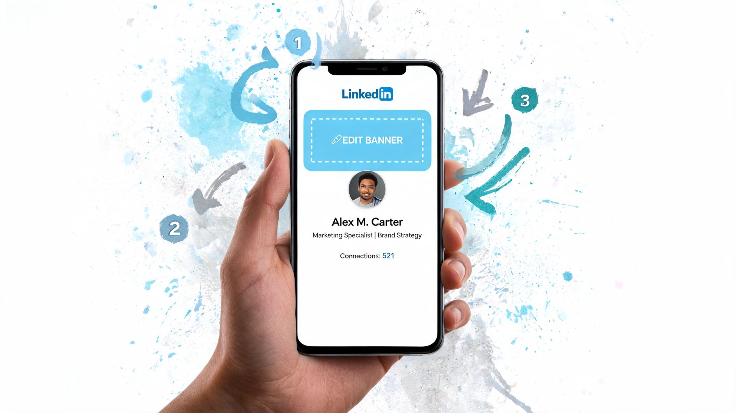
On desktop
Desktop remains the easiest way to change a personal banner, because the preview is bigger and positioning the image is more precise.
Go to your profile
Sign in to LinkedIn and click your photo or name to open your profile page.Click the pencil or camera icon on the banner
The edit control sits directly on the cover area.Choose to change the photo
Upload the new file from your computer.Set the position with care
If LinkedIn shows drag or crop controls, use them instead of trusting the automatic framing.Save the change
Then reload the profile and look at the live version.
Spacing problems are easier to spot on a big screen, so desktop suits banners with text. If yours carries a tagline, a certification or a role line, do the first upload on a computer even if you normally use LinkedIn on your phone.
On mobile
The app can do it, though it forgives less. It is fine for a quick swap and weaker for precise layout.
- Open the LinkedIn app and go to your profile
- Press the edit icon on the banner
- Pick the new image from your camera roll or files
- Look over the crop frame slowly
- Save, then view the whole profile again
You can change the banner from the app without trouble. The catch is that the app preview can hide layout problems until after the image is live.
If the banner has text on it, upload from desktop first and use your phone only to see how it displays.
An order of steps that saves a redo
- Prepare the image first in Canva, Kapwing or whichever design tool you like.
- Upload from desktop for finer positioning.
- Open the profile on your phone straight after saving.
- Check the top, both sides and the photo overlap before you call it done.
Most quick tutorials leave out that phone check, and it is exactly where many banner problems appear.
How do you change a LinkedIn company page banner?
The steps resemble a personal profile, with two differences: you need admin access, and the desktop editor is usually the better place to work because page tools are fuller there.
According to this company page banner reference, the desktop editor often has more features than mobile, including AI-based suggestions and, on Premium accounts, the option to build an image slideshow. The same source suggests 8-bit PNG for logos and transparent elements to avoid JPEG artifacts.
How a company banner differs
A company banner has more to do than a personal one. It may need to carry brand recognition, a campaign, hiring news, a product message or an upcoming event. More people have opinions about it and more text competes for space, which is a good reason to keep the design plain.
Work on desktop where you can. It makes it easier to judge the banner against the company logo, the page colours and the rest of the layout.
Steps for a company page
Open the company page you manage
Make sure you are signed in to the account that holds admin rights for the page.Switch to the admin view
Page controls live in the admin interface, in a different spot from a personal profile's edit button.Find the banner or cover image
Click the edit option on that section.Upload the new file
Use a finished file, not a draft exported in a hurry.Check how the logo sits on the banner
Transparent PNG files help, since logos and overlays tend to look cleaner.Save and review the live page
Look at it on both desktop and mobile once it is published.
Slideshow or single image
If the page has Premium features with slideshow access, rotating images can suit a brand with several messages. It helps less on a page that already looks crowded.
A single still image usually works better when:
- You have one message, such as hiring, a line about what you do or a category claim.
- The logo needs clean contrast against a steady background.
- The team wants a uniform look across employees' profile images.
A slideshow makes sense when you want to rotate event announcements, product lines or campaign visuals. If the goal is more followers for the page, a clear profile and regular posting usually count for more than extra motion. Teams working on that side can add the page to LinkedIn follower support as part of the plan.
How do you design a LinkedIn banner that fits your brand?
Swapping the image is easy. Deciding what goes on it is where people get stuck.
The banners that work tend to be restrained. They don't try to tell your whole career story. They give a visitor enough context to know what kind of profile this is: a short line about what you do, a simple visual identity, or a background that relates to your work.
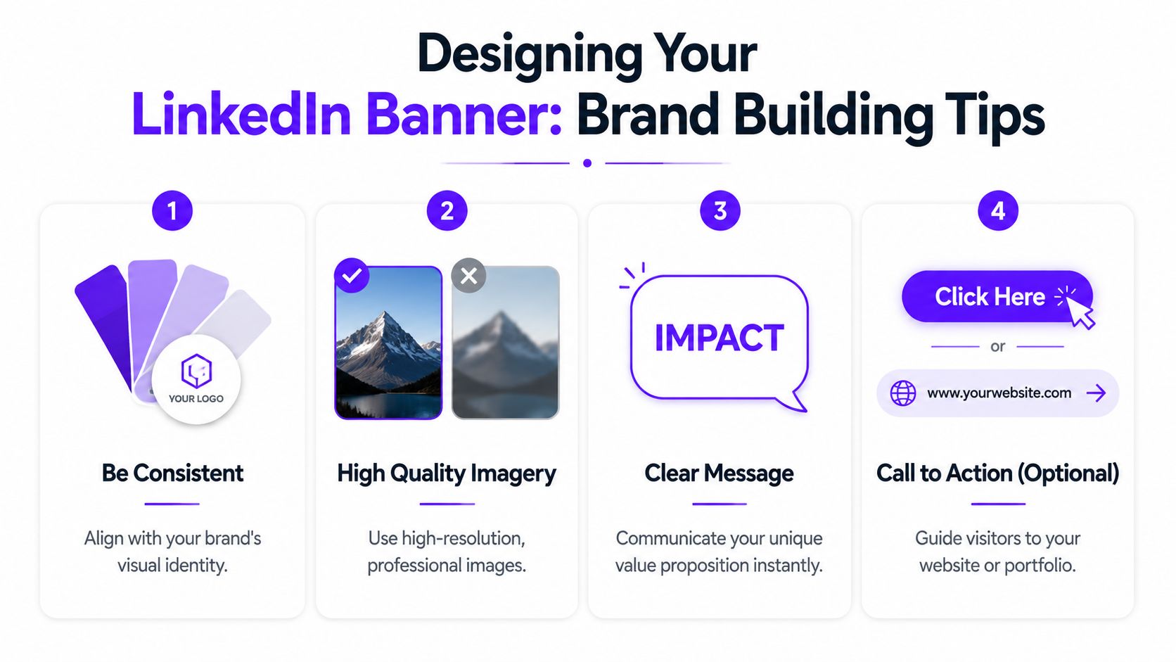
Four design choices that usually work
Keep the message short
A banner is no website header. If you add words, stick to one idea and let the headline and About section carry the detail.
Short lines that beat crowded copy:
- Product marketer for B2B SaaS
- Helping founders build clearer messaging
- Data analyst in fintech
- Hiring engineers across EMEA
Match the visual style you already have
The banner should look connected to your photo, headline and recent posts. A formal photo and tidy, business-focused posts sit oddly under a loud neon graphic.
Consistency goes beyond the logo. Build Emotion's advice on getting a brand recognised online treats it as repeated recognition across every touch, which applies here too.
Use contrast that holds up on small screens
Light grey text on a pale background can look elegant in the editor and vanish on a real phone. Go for strong contrast: dark text on a light field, or light text on a darker one, reads quickly.
Someone glancing at your banner for two seconds on a small screen should still understand it.
Leave empty space
White space earns its keep in a banner. It gives the profile room and stops the top of the page from looking cluttered.
What to put in and what to leave out
- Use your role, niche, logo, product category or one brand phrase.
- Use a photo only when it is relevant and uncluttered.
- Leave out long mission statements.
- Leave out dense clusters of icons.
- Leave out thin fonts that disappear on mobile.
For personal brands, simple text-and-colour banners tend to hold up better day to day than heavily designed ones, because they date more slowly and you won't need to rebuild the file each time your focus shifts. The LinkedIn banner maker produces this kind of layout at the right size.
If your plan includes networking, posting and turning profile views into conversations, LinkedIn connection support fits in once the visual side is sorted. The banner gets a visitor's attention, and the rest of the profile has to hold it.
What are the most common LinkedIn banner mistakes?
Nearly every banner problem comes down to one of four things: wrong size, wrong placement, wrong file type or a rushed final check.
Each has a quick fix. This Kapwing guide to LinkedIn banners notes that LinkedIn automatically resizes images that don't match the spec, which can cut visual quality by up to 30%. It also recommends a 20% safe area on every side for important text and logos.
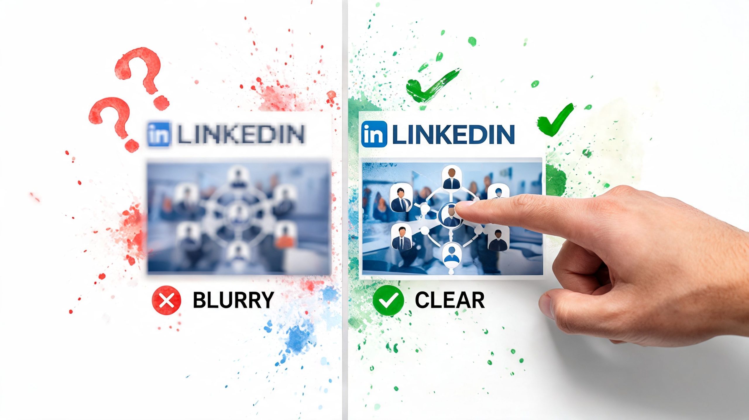
The banner looks blurry after upload
The source file was usually the wrong size or exported badly. Screenshots are frequent culprits.
Fix: rebuild or resize the image to the banner dimensions before uploading, and export it straight from Canva, Kapwing, Photoshop or your design tool instead of taking a screenshot of the design.
Text gets cut off on mobile
This is the layout mistake people make most. A banner can look centred on desktop while the app crops it harder.
Fix: move all text, logos and fine detail inwards, stay inside the safe area and keep clear of the edges.
The profile photo covers part of the design
On personal profiles the photo overlaps the banner, and people forget it. Text placed low and to the left can end up hidden behind it.
Fix: shift the main elements to the centre or the right, and keep the lower left light and uncluttered.
The upload fails or won't save
The cause is usually the file size or format.
Fix: confirm the file is JPG, GIF or PNG and under 8MB. If the app behaves oddly, try the same upload in a desktop browser.
The banner is done when it looks right on the live profile, and uploading it is only the first half.
Once the profile looks finished, the next job is getting people to see your posts. LinkedInLikes is a free community where LinkedIn members react to, comment on and repost each other's posts by hand from their own accounts. You share only a public post link; sign up and add your next post on the LinkedIn likes page.
Related reading
Frequently asked questions
1584 x 396 pixels, saved as JPG, GIF or PNG and no bigger than 8MB. Keep text inside a safe area about 20% in from each edge.
Update it whenever your role, offer, campaign or focus changes. If nothing has changed, look at it now and then to make sure it still matches your profile and posts. An old banner can be fine; an outdated one sends the wrong message.
GIF is one of the accepted formats, but a still image is easier to control for most people. Moving banners are not the standard for personal profiles, and static designs are usually easier to read. Company pages with Premium can use an image slideshow.
Canva and Kapwing are the most practical options, and our free LinkedIn banner maker exports at 1584 x 396. Treat any template as a first draft and adjust the spacing for your own profile.
The app crops the banner differently, and most tutorials barely cover it. As this guide to mobile banner display notes, a banner that looks right on desktop can be badly cropped in the app, so viewing it on a phone should be your last step.
Yes. Open your profile in the app, press the edit icon on the banner, choose an image, check the crop and save. For banners with text, upload from desktop first and use the phone to check the result.